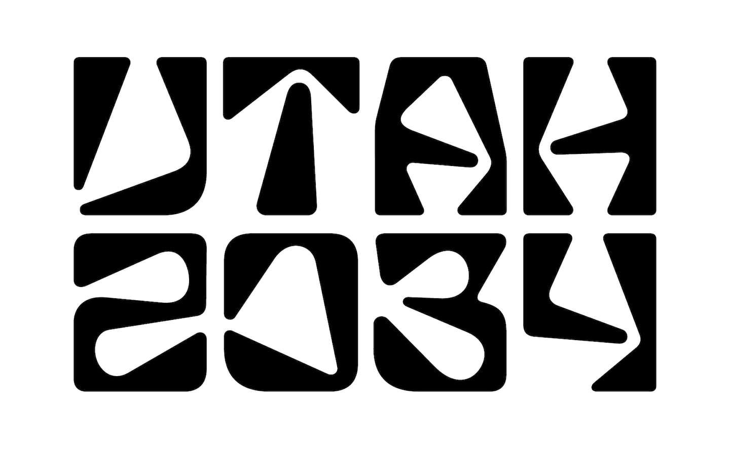
I’m no lover of the Olympics but the branding behind them fascinates me (see 99pi Mexico 68). This morning I stumbled across some hate for Utah 2034 and all I could do is shake my head; to be an Olympic Logo designer, what a thankless job in it’s time. I think the general trajectory of an Olympic logo is this:
- Unveiling: everyone hates it and loudly proclaims this
- Lead up to the games: through repeated exposure the image is rehabilitated in people’s minds
- Immediately following the games: people mostly have positive associations with it
- Legacy: this is where the timeless/iconic nature of the logo is actually proved. Will people remember it in 30 years? 50 years?
In general people hate new logos, anytime a company changes their logo there is going to be backlash which is why, it’s best to just keep moving forward and ignore the chatter for a few months. The Olympics are unique because the logo (and associated iconography) for each games is both a “brand new” logo but it’s also an iteration or a “redesign” of all previous logos. Of course, Utah is not Vancouver, or Turin but when people see this logo their mind is going to think of those logos and do, likely, the same thing it would for a corporate rebrand.
Personally, I think Utah 2034 is dope. Although, I might have skewed something in the A or H to avoid the 4 leaf clover look they’ve got going on.