
Diffs like this make me proud… Admittedly I also wrote all those 1365 lines; no regrets! They worked in production for about three years, the client switched vendors, the process is more streamlined now my work around was no longer needed.

Diffs like this make me proud… Admittedly I also wrote all those 1365 lines; no regrets! They worked in production for about three years, the client switched vendors, the process is more streamlined now my work around was no longer needed.
I’m excited to announce that I’ll be speaking at BEAM Europe in October. Would love to see you there and/or if your in the greater Haarlem area, happy to meet up!
Tickets are on sale now over at https://codebeameurope.com/ . Drop into my session if your interested in looking at how Ruby/OOP patterns can sneak into Elixir code bases when first adopting Elixir and how to refactor/avoid these.

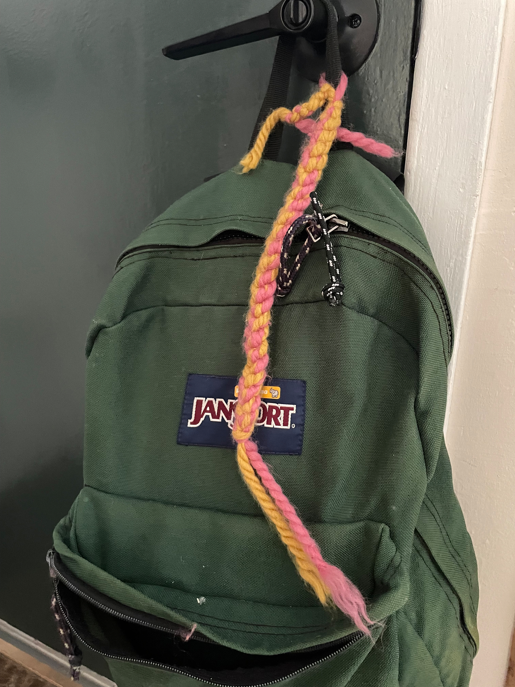
My daughter uses the same backpack I did 30 years ago! Hail to the once great, and again trendy Jansport.
I also love that she’s adorned it with some finger knitting!
First big snow

Another Christmas card
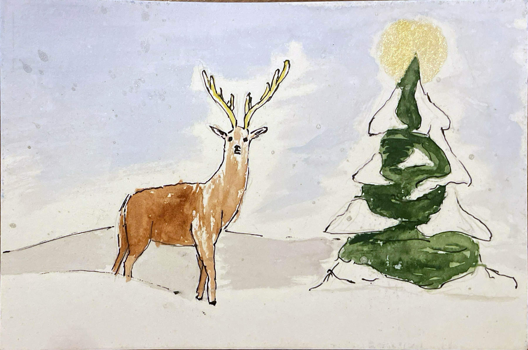
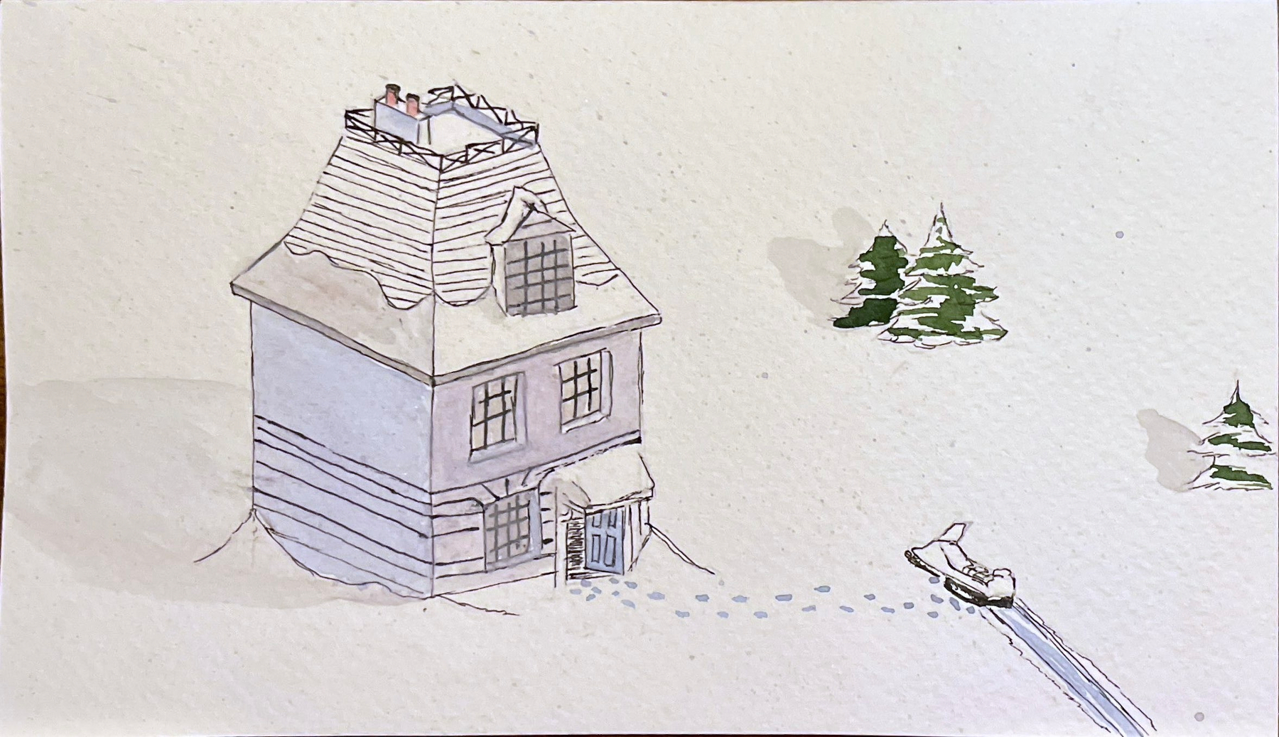
My wife and I have started painting our Christmas cards. I’m a big fan of Owen Pomery’s style, it kind of reminds me of Hergé. I copied this from Victory Point
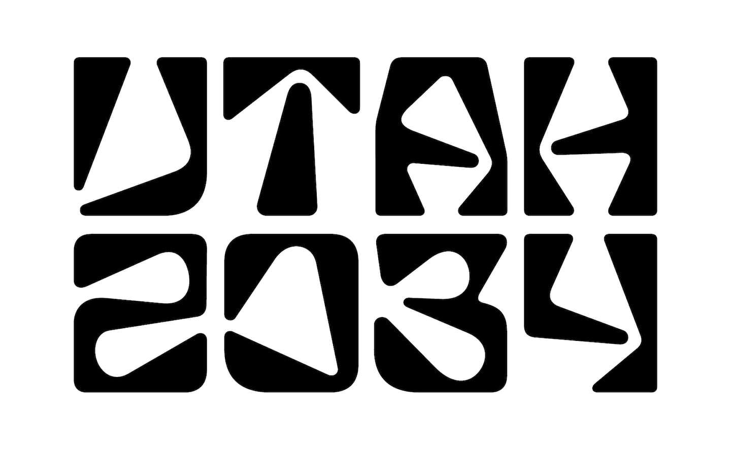
I’m no lover of the Olympics but the branding behind them fascinates me (see 99pi Mexico 68). This morning I stumbled across some hate for Utah 2034 and all I could do is shake my head; to be an Olympic Logo designer, what a thankless job in it’s time. I think the general trajectory of an Olympic logo is this:
In general people hate new logos, anytime a company changes their logo there is going to be backlash which is why, it’s best to just keep moving forward and ignore the chatter for a few months. The Olympics are unique because the logo (and associated iconography) for each games is both a “brand new” logo but it’s also an iteration or a “redesign” of all previous logos. Of course, Utah is not Vancouver, or Turin but when people see this logo their mind is going to think of those logos and do, likely, the same thing it would for a corporate rebrand.
Personally, I think Utah 2034 is dope. Although, I might have skewed something in the A or H to avoid the 4 leaf clover look they’ve got going on.
My daughter is going to a birthday party today, somehow this means making and writing the card falls on me.

First snow

I’ve been switching between Ghostty and iTerm a lot, mostly to take advantage of iTerm’s scroll back search but today it seemed appropriate to use Ghostty!
